
I migrated my site a couple of days ago. What are some of the differences, both feature-wise and visually? I’ll compare common actions on both.
Feature comparisons
Writing a new post: the process of writing a new post is dramatically easier with Hugo, and I think this is the biggest win from the transition. Having a server live-reload my drafts makes editing posts so much easier, whereas before I would have to run python makesite.py every time to preview my changes (using Python’s built-in http.server afterwards). Because Hugo is so fast, I have a sub-second feedback cycle.
Post structure: the structure of posts is mostly the same, with it being almost entirely pure Markdown. I use TOML front-matter instead of HTML comment metadata, but this isn’t too different. Hugo directives and cross-references mean that my posts aren’t entirely pure Markdown, but I can live with this.
Organizing content: the folder structure is the same as it was before, and I appreciate this. All my Markdown posts live in a content directory, and all the HTML is generated into a site directory when I build the site. Having categories (and eventually, possibly tags) is a substantial improvement over the old, monolithic “everything is just a post” approach.
Content redundancy: previously, I had to write a post and then add it to the homepage manually. While possible to automate this, Hugo makes it easy with autogenerated index pages and the summary features. Sorting pages by categories or tags, creating an archives page, and having a recent posts widget are all features that my old site lacked, but that Hugo gives to me for free.
Nice-to-have website features: things like a sitemap, localization, robots.txt, and whatever a searchindex.json is are features that I ignored on my old website. Hugo / my theme provides theses out of the box, though, and in principle these are nice for a website to have.
Responsiveness to different screen sizes: the old site was simple enough that any screen size could display it with ease. This applies to the new site, too, but it was a lot more work to reach this point. The theme took care of most of it, but disabling JavaScript meant that I had to rework the menu on mobile from scratch.
Changing styles or color schemes: on the old site, my CSS file was under 150 lines. The new site is literally, and regrettably, over 9000. Changing the style has become much harder, and it’s unlikely that I ever adjust the color scheme because there are likely dozens of locations to update in the CSS file.
Overall aesthetics: while a matter of personal opinion, I like the new design better. The colors are nicer, the three-column layout is more usable than the single-column one, and there’s more content on a single page.
Overall complexity: is unfortunately, much higher now. There are simply more files to deal with, and there’s more overhead from Hugo and the theme that I’m using. There are dozens of features which I will never use that introduce incidental complexity to the whole project. I removed lots of JS files and templates that I didn’t need, but surely a lot more remains.
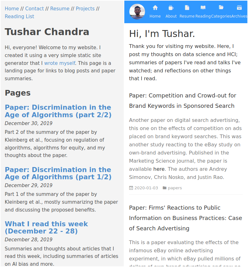
Image comparisons - homepage
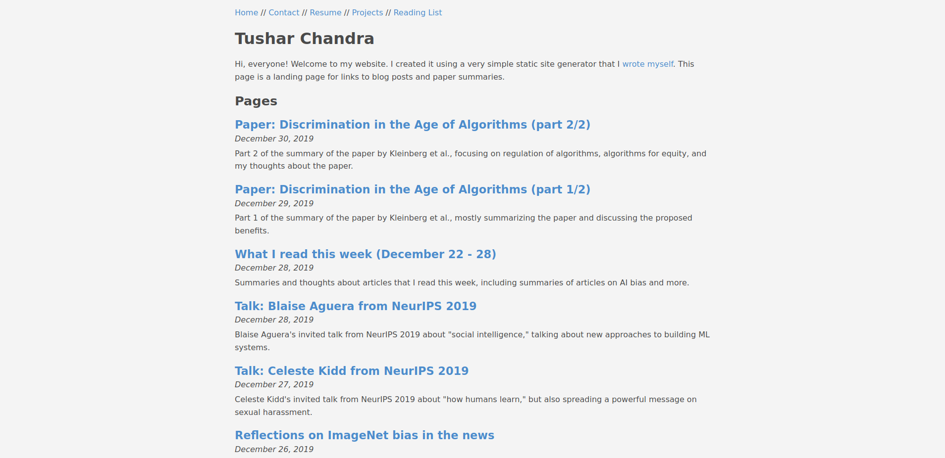
The core content of each page is the same: a list of posts. Visually, the layout has obviously changed from single-column to three-column, with the header contents now being in the left sidebar with some new stuff (my photo, title, location, and updated links).
The right sidebar is totally new. It shows categories and recent posts, which are both feature I got when upgrading. The categories listing is helpful, but the recent posts is redundant with the contents of the homepage. In the future, I might use this space to showcase my favorite posts or something else.
Having the sidebars remain visible as I scroll is nice, especially compared to the header navigation which disappears the moment you scroll down. This is probably trivial to any designer or web developer, but I am neither.
The overall site has more contrast, too. The bright blue left sidebar stands out from the white center, but a more subtle change is the improved contrast between the text and the background. While the old color schemes still met accessibility standards, this is definitely easier to read.
Image comparisons - reading list
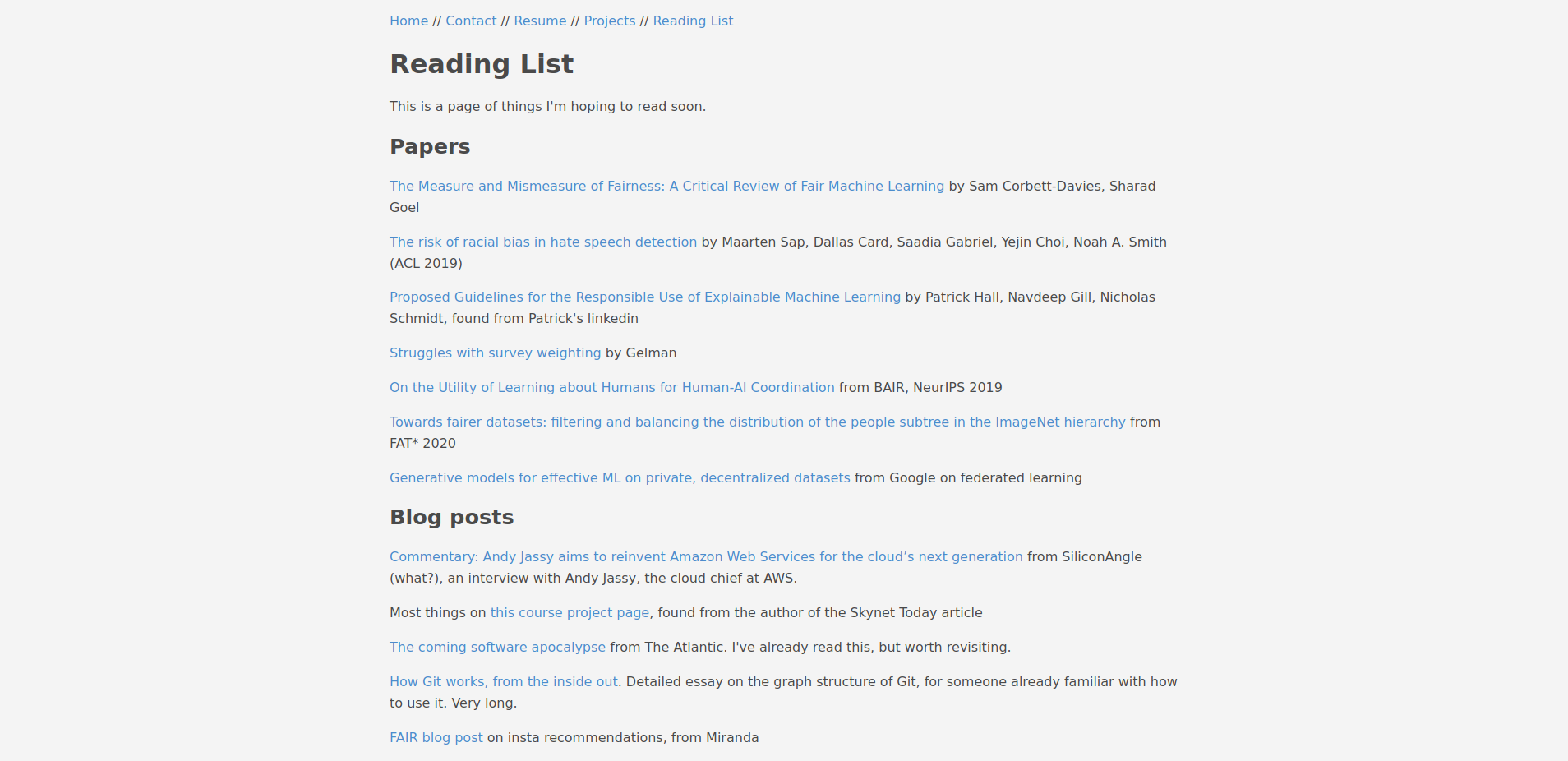
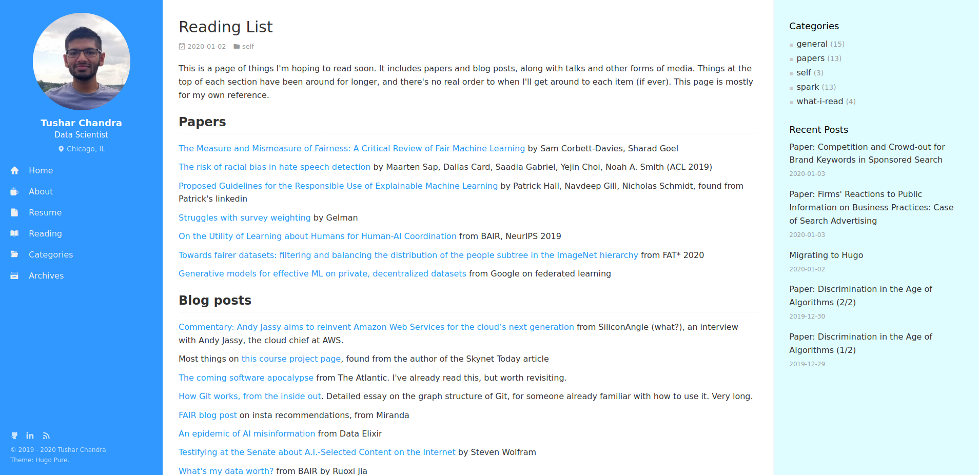
Here, we see more value in the space that recent posts takes up, because it’s not redundant with the rest of the page. The navigation being pinned to the left helps as I scroll down on the page. The styling of the main content is just personal preference and not terribly different.
The verdict
I like the new site a lot better. My biggest complaints are the (probably unnecessarily) enormous CSS file and the overall increase in complexity, but the improvements in features and aesthetics are striking. Perhaps some of this is just the novelty effect; only time will tell. But, on the whole, I am quite happy with Hugo.