
When visualizing the uncertainty around treatment effects, one can choose (among others) to visualize the standard error (uncertainty in the mean) or the standard deviations (uncertainty in the observations). Modulo sample size, the two contain the same information, but this paper demonstrates how people regularly associate the former with larger effects than the latter.
Authors: Jake M. Hofman, Daniel G. Goldstein, Jessica Hullman
Link: ACM Digital Library
Background and results
Uncertainty is important in scientific results, and papers will often report it as part of their results. There are different types, though, and this paper studies some of the differences (and in particular, their effect on readers).
Scientists often choose to display either inferential uncertainty (e.g., uncertainty in the estimate of a population mean) or outcome uncertainty (e.g., variation of outcomes around that mean) about their estimates. How does this choice impact readers’ beliefs about the size of treatment effects? We investigate this question in two experiments comparing 95% confidence intervals (means and standard errors) to 95% prediction intervals (means and standard deviations).
Let’s rephrase that, because it took a while for me to understand:
- confidence intervals / interfential uncertainty try to estimate e.g., a population mean, and show intervals around that value. That’ll be 95% confidence interval for what the mean of some quantity is
- prediction intervals / outcome uncertainty show variation in individual outcomes, instead of the mean or any other statistic. Here, one would take samples of two quantities and make e.g., histograms or boxplots of the samples themselves.
Displaying inferential uncertainty (or confidence intervals relative to prediction intervals), the authors show, can cause participants to overestimate the effect of a treatment.
We contribute two large pre-registered randomized experiments in which we show people different visualizations of the same underlying data—some of which focus on inferential uncertainty and others on outcome uncertainty—and query beliefs about the size of treatment effects.
We measure participants’ judgments using three proxies that vary predictably with the treatment effects: willingness to pay for a treatment, probability of superiority in which we ask participants how often they believe they would win a competition with or without the treatment, and belief distributions, that is, subjective probability distributions describing outcomes in the treatment and control groups.
Visualizations of inferential uncertainty led to more confidence by all three measures (higher willingness to pay, higher probability of superiority, understate variability in outcomes).
Communicating uncertainty
Error bars are the most common method of visualizing uncertainty, but their usage is inconsistent—sometimes they mean standard errors, other times standard deviations, and rarely confidence intervals. They can lead to incorrect heuristics, too, like overlapping error bars meaning no significant difference and non-overlapping bars meaning a significant one, or the probability distribution over the error bar range is uniform. The authors spend two paragraphs to convince us that people just don’t understand error bars!
Experiment 1: differences in how people perceive the same effect presented differently
The experimental design for these kinds of studies is always interesting because of how tricky it is to elicit people’s understandings of uncertainty or probability (see A Bayesian Cognition Approach to Improve Data Visualization).
We told participants that they were athletes competing in a boulder sliding game, playing against an equally skilled competitor named Blorg. The goal of the game is to slide a boulder on ice farther than the opponent’s boulder. There is an all-or-nothing 250 Ice Dollar prize for the contestant who slides their boulder the farthest. Participants were given the opportunity to rent a superior boulder (i.e., undergo a treatment) that is expected (but not guaranteed) to increase their sliding distance for their next and final competition. They were then shown a visualization that provided statistics about both the standard and special boulders with an accompanying caption. Finally, they were asked how much they were willing to pay for the special boulder and to estimate the probability of winning if they used it.
The results, in the spirit of the experiment, are shown below in two different ways:
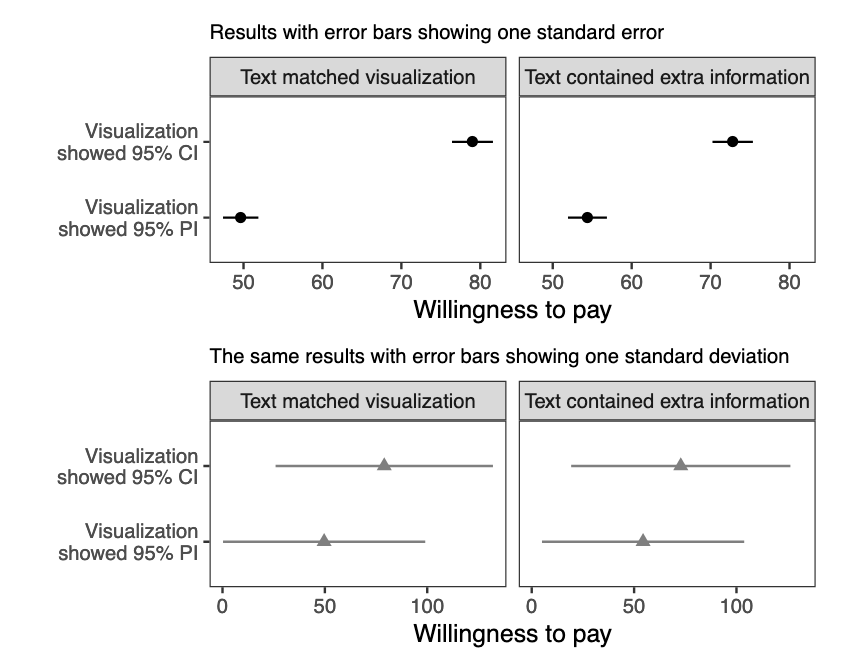
The top graph shows mean willingness to pay with error bars showing standard errors of the estimate of the mean. The bottom graph shows mean willingness to pay with error bars showing standard deviations of individual responses. Participants were willing to pay more when graphs looked like the top one.
Experiment 2: exploring alternatives
The second experiment studied the effect observed in the first. The authors came up with four alternatives for this kind of visualization (the two from the first experiment, the standard errors but with the y-axis rescaled to the full range of observations, and an animated example). They also tested a large and small effect size as a robustness check. This resulted in a 2 x 4 experimental design, and Figure 6 below gives away the main point.
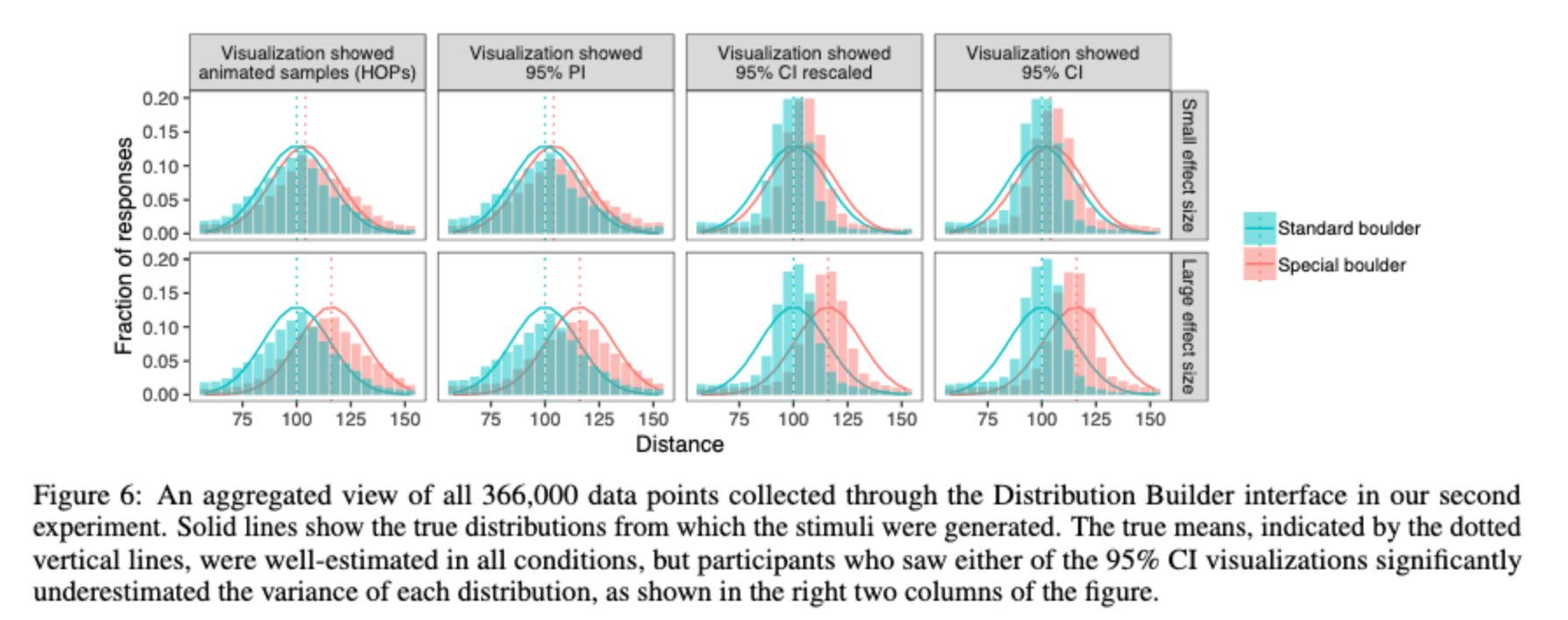
This was collected through a tool called Distribution Builder, which is an interface for assessing people’s beliefs about probability distributions. Note the right two columns: participants who saw the 95% confidence interval visualizations underestimated the variances of each distribution.
Reflections
This paper studies an interesting question that I had not thought about until now. I don’t think I fully realized that there were two terms for these different types of uncertainty. And, truth be told, the details of standard error vs. standard deviation were something that my science teachers attempted to teach me, but I never fully understood, and I relied on definitions and formulae without understanding them.
So, needless to say, this paper studying the differences between them helped to clarify my own understanding as well! The main finding is that displaying differences in the mean of some outcome (standard errors), instead of differences in the outcomes themselves (standard deviations), can mislead people into overestimating the magnitude of the difference (e.g., how much better a treatment is).
Mathematically, estimating the sample standard deviation from visualizations of population statistics requires readers to multiply the size of the standard error bars by the square root of the sample size (i.e., standard error = standard deviation / sqrt(n)). That’s really difficult! It seems beyond obvious that people won’t do that in their head.
But obvious results can still be useful. Armed with the knowledge that people will underestimate outcomeuncertainty when presented with inferential uncertainty, the question of “what are you trying to convey with your visualization” becomes even more important. Smaller error bars mislead our eyes and brains, it seems, and this is one of many ways that it’s possible to mislead with data.